

Final Podcast Cover Design
Start to Finish: A sample design project
The Reviewniverse is a comedy podcast for which I created a podcast cover. The creators sent me some initial ideas they had for a cover as well as some early recordings of the podcast. After listening to their ideas, I sent them a creative brief to learn more about the premise of their podcast, their target audience, and their long term plans for the show.

Mockup idea provided by the client
Mood Boards
Next, I put together mood boards to get a better idea of what the clients liked and disliked for potential design aesthetics. I was already getting some impressions about their sense of humor and tastes based on the early research, so I geared the mood boards toward those impressions.

Mood boards
Brainstorming
Both Steve and Chris had a strong reaction to the "Why Are We Here?" poster on mood board 1. They also liked the look of the title "Astonishing Stories" on mood board 2. With these ideas in mind, I moved forward to brainstorming some layouts for the cover.
I came up with as many rough ideas for layouts as I could. I took elements of some ideas and reworked them into other designs. When I was finished I sent the thumbnails to my clients to see which rough layouts stood out to them. They were mostly interested in the ideas that were closer to that initial "Why Are We Here Poster?" They liked the idea of cartoon versions of themselves, so we settled on focusing on A1, B2, and C3.

Layout Thumbnails
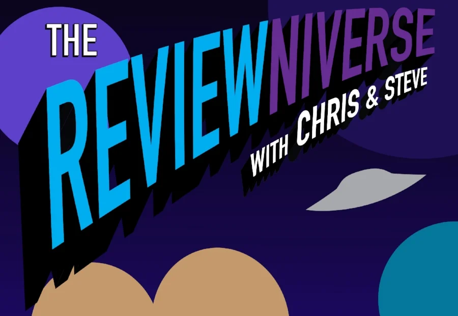
Early Logo Design
I started work on a logo design that mimicked the exciting comic cover style they liked. I wanted something that looked like they sounded when they said the opening title of their podcast. "Reviewniverse" is such a long word, it made sense to make it arc into the distance. The 3D look helped make look like it was shooting off into space which seemed to go with their theme.
Caricature Illustration
With an idea of where we were going, I asked the guys to send over some more photos of their faces to help do the caricatures more accurately.

Client Photos
From those, I created the first sketch of their reactions to the universe...

First sketch
When I sent the sketch for approval, they loved the art but had one important critique: Since we had only interacted by email, they told me the picture was odd because Steve is actually much shorter than Chris in real life. So, doing what I could to preserve the initial drawing, I came up with this solution:

Shorter Steve sketch idea
Background
I had two styles in mind for how to illustrate the background. I created a vector-style version in Illustrator and a more realistic looking version in Photoshop. I mocked up some examples to send the clients to let them decide what they liked better.

Realistic background vs. vector background
They preferred the more realistic looking outer space, so I set to work creating that style of background. From that, I began playing with colors for the logo and their shirts that stood out from the background.
Finishing Touches
We settled on the orange color for the logo, and I touched up some shading and highlights on the caricatures. After sharing the design with a few people, it became clear the hands were still too confusing since it was hard to tell whose hands belonged to whom. I adjusted the drawing again and came up with the final design. I also provided them with some other files they could use in other places such as Facebook banners and images of the logo for t-shirts and stickers.

Banner 1
Logo images

Final Cover